- Titles would appear at the end after a fade to black
- no actors/directors name shown throughout the trailer as they are not bankable stars and therefore wastes time. Can show them at the end along with the titles however as seen in Moon
- Festival awards should also be shown at the start to get the audiences excitement

- Due to being a science fiction film, the text would most likely have to be futuristic or computer like
- However I would like to keep it simple as I feel thats much more effective
- As the film is about AI it perhaps could introduce some thing along those lines? Computer code?
- Moon (as seen above), Enders Game and The Phoenix Project all contain these ideas
Ewans Proposal
For my titles, I want the graphics to be plain and simple, with some sort of distortion, maybe a blur or have them fade in from some flare. Examples of these are trance: as shown below, where the use of the blur on the grunge background makes for the text to be clean.
I also want to look at the use of motion graphics, such as the 'welcome to the punch' titles, as they fade in from distortion caused by flares as shown below.
Emmas Proposal
To begin my research on graphics, I first looked on artofthetitle.com, who have an extensive range of stylised and famous film graphics. I particuarly liked the title artwork for 'Manhattan', a TV drama. It is the use of the thin black font that i believe would look nice for the title of my proposal as for the title graphics, i am interested in this stylised slick font.
I then looked at film titles and posters, examples of this would be the title of Taken. This graphic looks much more furturistic and harsh than others i was looking at as it has a much thicker wording and the orange font colour lifts it off the primarily black background. I also like the main title of Inception, primarily the use of spaced out lettering. This creates a much more imposing and professional feel as it consumes much of the screen.
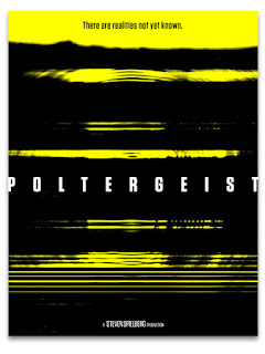
I also like the idea of using yellow combined with either black or white. I believe this makes a statement and also creates a sense of unease though the punchy colours and bold graphics
Using this for a graphic, would make it look very unusual however would fit with the thriller nature of the film.


No comments:
Post a Comment