We want to give our film a sense that something is always off without ever showing it explicitly. This is something 'Fight Club' does extremely well with the constant nods to the ending of the film that you only pick up on if you've already seen the film or have read up on it. These then greatly enhance the movie, on the second or third viewing. I have shown most of the hidden clues in 'Fight Club', to show how we can do something similar.
AF
Wednesday, 3 December 2014

Characters/Costumes
As our film has got two female protagonists, films that have influenced us for our characters are Alien or Hunger Games, because they have both got strong female leads. In Alien, Sigourney Weaver's Ripley, and in the Hunger Games, Katniss played by Jennifer Lawrence, are both influential and strong in their respective stories which also has made them such iconic characters. We want our protagonists to be like this as our film presents them with the challenging task of saving the world from technological collapse.

 This outfit is a little too much (in particular the glasses) but this is the general feeling and style we want to aim for with the strangeness of the look. From what we can tell, this feeling comes from the contrast of the two predominant colours (blue and pink), which clash together. This should be easily achievable, though I feel like we should use more earthly colours which makes sense as it would look better on camera and also she is trying to appear as normal as possible. As we are also trying to play with colour in our opening, having her stand out with out of the ordinary colours would make it easier for us to highlight her in the scenes and enhance those colours as we planned.
 This outfit is very similar to the style we want to produce. Not only does the sweater match the wintery setting of our film, but also is more functional. The striped socks and slight patterning on the trousers are again the parts that highlight the character's individualism and also shows that is out of the ordinary. This costumes is also great, as it combines the features of the last costume, the clashing colours (green and red) with the more earthly colour scheme that we were aiming for.
 This is Diana and mine favourite pictures out of all of them, mainly because she is not just posing as herself rather than playing the character which makes it feel less staged. Also the girl we have chosen to play girl A wears predominately clothes of this style, which suit the character rather well. Of course we will have to add some extra accessories or another part to the costumes which creates the sense of strangeness around her, but overall I feel this is a good template to follow on from.
 One idea is of course, khaki or army patterns of any kind. They would have to be layered under a good winter coat (maybe waterproof), but am army jacket or trousers would give the character the right sort of edge and sense of toughness and ability to deal with the combat and difficulties ahead. However I also feel like, the army coat can be seen as very cliche and overused.
 Another image that most people expect of people living on the street is the bean-hoddie combination. Not only is it practical for the cold weather, but also keeps her more anonymous - just another face in a crowd of people, meaning that when we want to show her escaping the other girl and cornering her, this look could be better for. This look is also very useful as it gives the impression that this character ought to be unremarkable but yet somehow she is chosen to save the planet.
 After looking at some of our film influences we also saw that a perfect model for this character would be the boy from 'The Road', which we are using as one of our influences for the colour scheme. Not only does he wear many layers, which give him the study, study rough look that we are aiming for but also his clothes show signs of dirt and wear that you would expect someone living on the street would have. Also he is caring a backpack of some kind, which would obviously be a necessity for a homeless person and something we should implement to give our film a sense of realism.
 To further these ideas shown above, we should use a combination of ripped jeans and a flannel underneath the hod die and coat to also further the urban feel, that this character should be showing. Similarly the ripped jeans are fairly easy to come by and we help to illustrate the fact that she's had the clothes for a long time and they've been through a lot.
DY


Girl A
This girl is from a parallel universe and has been sent back into this one to enlist the help of the other girl in order to save both worlds. As she is from a parallel universe she is trying to blend in to our society. We are going to take inspiration from both the costume and acting style of Evanna Lynch, who was Luna Lovegood in the 'Harry Potter' franchise. We are hoping to use fairly normal clothing but using bright or out of place colours and accessories to show the fact that she isn't from this world.
This outfit is a little too much (in particular the glasses) but this is the general feeling and style we want to aim for with the strangeness of the look. From what we can tell, this feeling comes from the contrast of the two predominant colours (blue and pink), which clash together. This should be easily achievable, though I feel like we should use more earthly colours which makes sense as it would look better on camera and also she is trying to appear as normal as possible. As we are also trying to play with colour in our opening, having her stand out with out of the ordinary colours would make it easier for us to highlight her in the scenes and enhance those colours as we planned.This outfit is very similar to the style we want to produce. Not only does the sweater match the wintery setting of our film, but also is more functional. The striped socks and slight patterning on the trousers are again the parts that highlight the character's individualism and also shows that is out of the ordinary. This costumes is also great, as it combines the features of the last costume, the clashing colours (green and red) with the more earthly colour scheme that we were aiming for.This is Diana and mine favourite pictures out of all of them, mainly because she is not just posing as herself rather than playing the character which makes it feel less staged. Also the girl we have chosen to play girl A wears predominately clothes of this style, which suit the character rather well. Of course we will have to add some extra accessories or another part to the costumes which creates the sense of strangeness around her, but overall I feel this is a good template to follow on from.
Girl B
At first we both didn't have much of an idea for a style for the girl living on the street, and instead we have focused on gathering certain visual cues that should help the audience in understanding this character. It will be impossible to give the costume, the wear and tear feel that professional studios are able to achieve but nevertheless we will be able to do it on a very basic level for example crumple her clothes to show that she's ben living in them for a long time.
One idea is of course, khaki or army patterns of any kind. They would have to be layered under a good winter coat (maybe waterproof), but am army jacket or trousers would give the character the right sort of edge and sense of toughness and ability to deal with the combat and difficulties ahead. However I also feel like, the army coat can be seen as very cliche and overused.Another image that most people expect of people living on the street is the bean-hoddie combination. Not only is it practical for the cold weather, but also keeps her more anonymous - just another face in a crowd of people, meaning that when we want to show her escaping the other girl and cornering her, this look could be better for. This look is also very useful as it gives the impression that this character ought to be unremarkable but yet somehow she is chosen to save the planet.After looking at some of our film influences we also saw that a perfect model for this character would be the boy from 'The Road', which we are using as one of our influences for the colour scheme. Not only does he wear many layers, which give him the study, study rough look that we are aiming for but also his clothes show signs of dirt and wear that you would expect someone living on the street would have. Also he is caring a backpack of some kind, which would obviously be a necessity for a homeless person and something we should implement to give our film a sense of realism.To further these ideas shown above, we should use a combination of ripped jeans and a flannel underneath the hod die and coat to also further the urban feel, that this character should be showing. Similarly the ripped jeans are fairly easy to come by and we help to illustrate the fact that she's had the clothes for a long time and they've been through a lot.DY
Graphics
At the moment, we are undecided on a name, but we are leaning towards De(i)fied, as this can be read as defied or deified. We think this could work as a name, as it's interesting and catches the audiences attention.One of the style we want to go for a simplistic but effect way to show the two different words.


 We used dafonts to try and find some fonts. This is the font from 'Alien', a film we are taking some influences from, with a strong female lead. I like this font because the 'I', is different causing it to stand out and the audience can easily see the different words.
This is also why we're leaning towards the brackets around the 'I' as it makes it easier to see the two different words. We're also unsure about this font though, as it is from a very recognisable film in Alien and is not a very strong font, so may look out of place on the screen.

 This font is quite different as although its still very simplistic it is a lot thicker, which could be very important, and as as the I is larger it also fits in with the plan to make it stand out.
Below I have also edited the first font to elongate the I and make the tops longer, this was part of Diana's original idea for the title. I'm still unsure on this as, I'm afraid it makes it too hard to read both words and makes it look far more like 'De fied' than one word. This is something we need to discuss
 I have edited this font a third time now, trying different things. I have taken out the little bars on the E as I thought that gave it all too gothic look that wasn't in theme with our film. Having done that I enjoy this font, a lot more.
AF
We used dafonts to try and find some fonts. This is the font from 'Alien', a film we are taking some influences from, with a strong female lead. I like this font because the 'I', is different causing it to stand out and the audience can easily see the different words. This is also why we're leaning towards the brackets around the 'I' as it makes it easier to see the two different words. We're also unsure about this font though, as it is from a very recognisable film in Alien and is not a very strong font, so may look out of place on the screen.
This font is quite different as although its still very simplistic it is a lot thicker, which could be very important, and as as the I is larger it also fits in with the plan to make it stand out.Below I have also edited the first font to elongate the I and make the tops longer, this was part of Diana's original idea for the title. I'm still unsure on this as, I'm afraid it makes it too hard to read both words and makes it look far more like 'De fied' than one word. This is something we need to discuss
I have edited this font a third time now, trying different things. I have taken out the little bars on the E as I thought that gave it all too gothic look that wasn't in theme with our film. Having done that I enjoy this font, a lot more.AF
Monday, 1 December 2014
Audience Research - Vox Pops
These are the vox pops we did to better understand our target audience (16/17). We did this so that we can hear there views and adjust our narrative to suit them. Some important comments were having female characters as more than just sex objects and this is something we are hoping to have, with two female leads in our film. Other comments that came up consisted of people hating on love triangles in films. As our aim is to have two strong female leads, we are also hoping to have no romantic relationships between our characters to give them a stronger base and appeal more to our female audience.
AF/DY
Style/Tone
The genre that we're going for in our film opening is a sci-fi conspiracy thriller. Influences for our style/genre of film include Fight Club, Se7en and Invasion of the Body Snatchers. With Invasion of the Body Snatchers influencing our plot and Se7en and Fight Club, the tone and some story elements.


One of our main plans is to alter the colour of our opening, we want to use brighter specific colours for the shots with the richer girl and then also enhance certain colours in the editing process after. We then want to use washed out, darker colouring for the poorer girl shots, showing how dark and gloomy her life is. An example would be 'The Road'.

Examples of the richer girls shots would be, examples of this would be Wes Anderson films such as 'Moonrise Kingdom' and 'The Grand Budapest Hotel'. His films have a saturated burst of colours that we wish to try and emulate. This should give the impression of the richer girl's life being idyllic and she's enjoying life.


One of our main plans is to alter the colour of our opening, we want to use brighter specific colours for the shots with the richer girl and then also enhance certain colours in the editing process after. We then want to use washed out, darker colouring for the poorer girl shots, showing how dark and gloomy her life is. An example would be 'The Road'.
Examples of the richer girls shots would be, examples of this would be Wes Anderson films such as 'Moonrise Kingdom' and 'The Grand Budapest Hotel'. His films have a saturated burst of colours that we wish to try and emulate. This should give the impression of the richer girl's life being idyllic and she's enjoying life.
An important theme of our film is also the feeling of something being slightly off, and so cues should be deployed throughout the opening. Particular influences for this are Fight Club, which I will talk about in a later post and the not well rated, film 'The Host'. The plot of 'The Host' is similar to Invasion of the Body Snatchers where there is always the feeling of something off. In The Host, you can spot who had been taking control of from the colouring in there eyes. This is a simple but effective clue, and we would like to try and do something similar.
Locations
- Girl A's house
- St Martins Rd, near Stockwell Station
- This is a good location as the houses around are all quite large, giving the impression to the audience that she is rich, without saying it. It is also good as it leads onto Stockwell Estate (where we want to film, where the other girl is walking down) making it easier to link the two scenes together.


- Where Girl B is living
- Clapham Common Park
- We want to use this location because it is open at all times and therefore we can film whenever we want, this means we could film during the morning or sunset when the lighting would be best as it is a very scenic location with the dappled light from the trees. The remements of the fire can also be seen, to give the location a relastic setting.


- Street where Girl B is walking down
- Landsdowne Way Estates
- We choose this location because the rows of estate houses will show the urban landscape and create the necessary atmosphere of loneliness that we wanted to show


- Street where Girl A is walking
- College Road
- This is a great location as there is a large pavement, with lots of space around, meaning we can get a lot of different angles.


- Where they cross
- Lovers Road, College Road
- This location seems perfect as it is a very scenic location, with a long street so you can see both girls easily. The trees also line up to give a lighting style that we want to blend the two colouring styles together.


- Where Girl B sees Girl A
- Clapham High Street, same place as alleyway
- I feel like this location is great as there are many different shops, to give a good scenic backdrop for the shots. The road is also quite busy at times, meaning that it will give the shots a more realistic feel
- Alleyway
- Bourchier Street
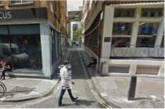
- We choose here because there are a lot of little alleyways leading off from the street. The street is also a main road with plenty of shops meaning it will be easy to give the impression that the poorer girl knows this area better. The Alleyway we are hoping to use is also good as it is hidden when walking down the street, making it easier to film, the poorer girl escaping. It then leads to another alleyway and a larger space, where she could trap her.


AF/DY
Narrative
- Two girls
o One
rich (Girl A) - Big house, family, bed (Claras house)
o One
poor (Girl B)– living on the street, rough-looking (Yasmina)
- Show the morning routine of each girl
o Rich
– normal, gets up, dressed, breakfast, teeth, says goodbye to Mum leaves (presumably to go to school, backpack?) - Give impression of a normal girl with something slightly off (wearing slightly odd clothes that you wouldn't normally see)
o Poor
– Sleeping bag, park, pickpockets a wallet, doesn’t change her clothes, wanders
(Clapham Common Park)
o Both
are wearing same necklace??
- Parallel shots of them walking down very different streets (rich vs poor), end up on the same street (Stockwell vs Estate)
- Come out on opposite sides of (Lovers walk, college road)
- A stops and then follows the other down the road
- Looking at her from across the street taking pictures of her while she’s looking in a shop window (blinking = camera???) (urban street, Clapham high street, lordship lane)
- B notices A in reflection, looks around, walks away slowly and ducks into an alley (central London)
- B starts to run away, with A running after
- B manages to evade A and get behind her, backs her into a corner
- A then tells B of why is is following her, ending on a simple but effective one liner
GENERAL PLOT
The world is being destroyed by technological
collapse, rich girl the only one who can save it with the help from the poor
girl who is from a parallel world where this has already happened
AF/DY
AF/DY
Subscribe to:
Posts (Atom)